Detskiy Mir: DM tech department
DM Tech is the department responsible for the websites and apps of all Detskiy Mir brands. But it also has its own unique branding.
I developed a visual style for the in-house UX lab and created stylish merch for department employees.
[art direction, graphic design]
DM Tech is the department responsible for the websites and apps of all Detskiy Mir brands. But it also has its own unique branding.
I developed a visual style for the in-house UX lab and created stylish merch for department employees.


︎
Detskiy Mir: All brands
Detskiy Mir is the largest children’s goods retailer in the CIS, with two sub-brands: Zoozavr, a pet goods retailer, and Eshe, a discount retailer.
I expanded and refined the Zoozavr brand book, developed new guidelines for Eshe’s digital banners, created an engaging recruitment campaign tailored to diverse audiences, launched the company’s first-ever photoshoot featuring real employees, and refreshed the visual identity of promotional discount campaigns.
[graphic design, art direction]
Detskiy Mir is the largest children’s goods retailer in the CIS, with two sub-brands: Zoozavr, a pet goods retailer, and Eshe, a discount retailer.
I expanded and refined the Zoozavr brand book, developed new guidelines for Eshe’s digital banners, created an engaging recruitment campaign tailored to diverse audiences, launched the company’s first-ever photoshoot featuring real employees, and refreshed the visual identity of promotional discount campaigns.


︎
RELO
[branding design]
Full branding for a recruitment agency focused on relocation. The company’s mission is to help clients find their dream job anywhere in the world.
A typographic logo and a dynamic gradient were chosen to appeal to the widest possible audience while keeping the visual identity flexible and adaptable across various events, formats, and applications.
[branding design]
Full branding for a recruitment agency focused on relocation. The company’s mission is to help clients find their dream job anywhere in the world.
A typographic logo and a dynamic gradient were chosen to appeal to the widest possible audience while keeping the visual identity flexible and adaptable across various events, formats, and applications.


︎
Yandex Zen: events
[art direction, graphic design]
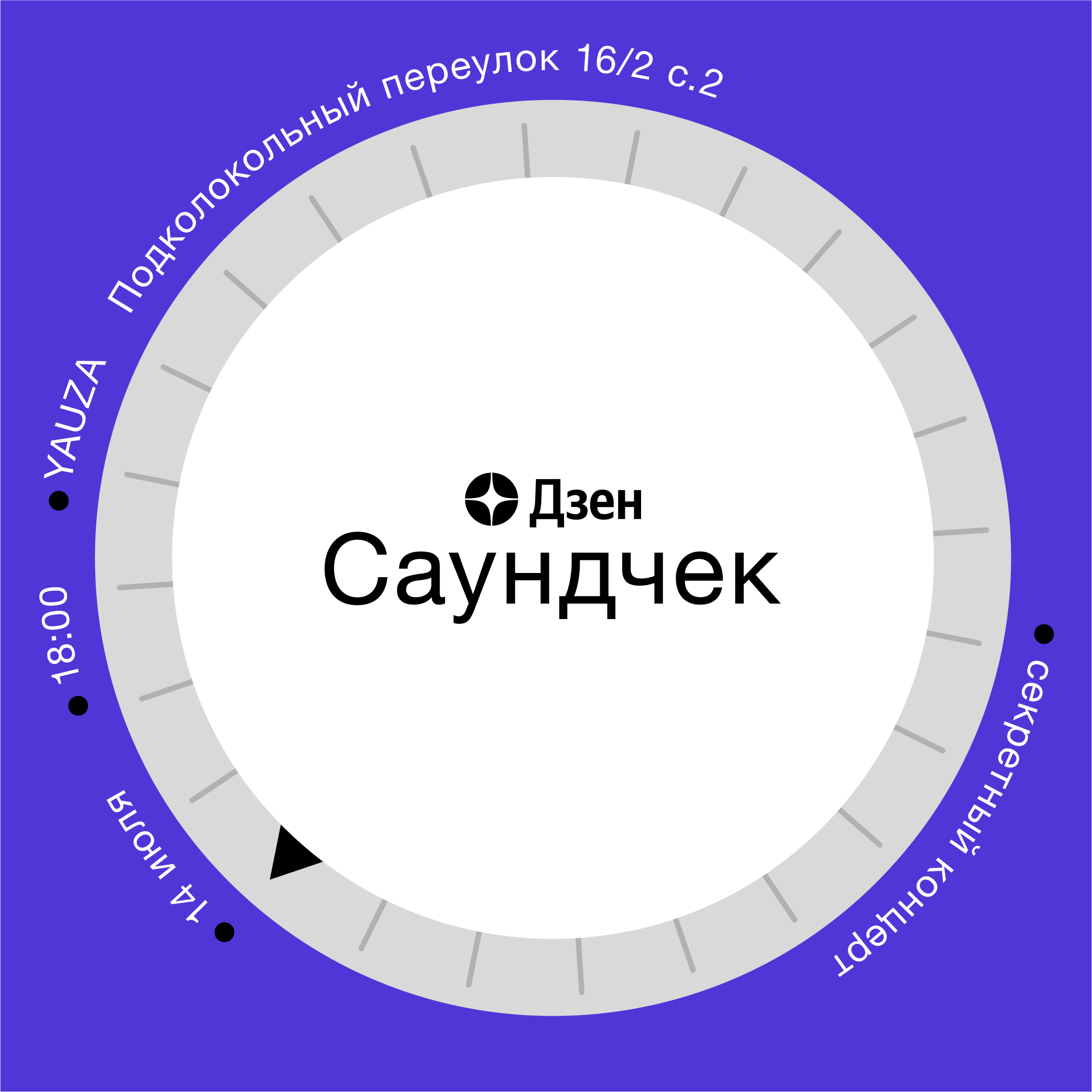
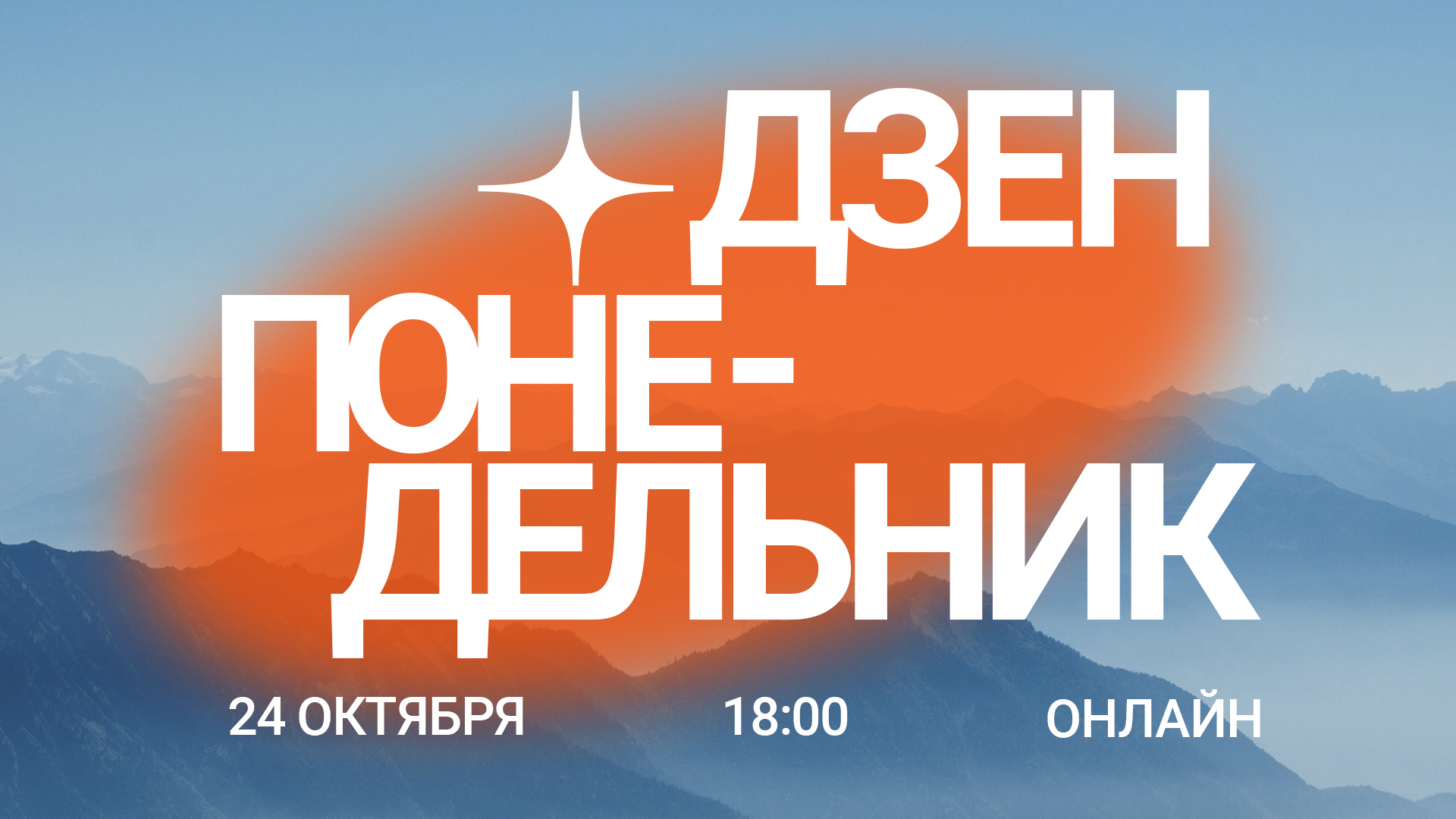
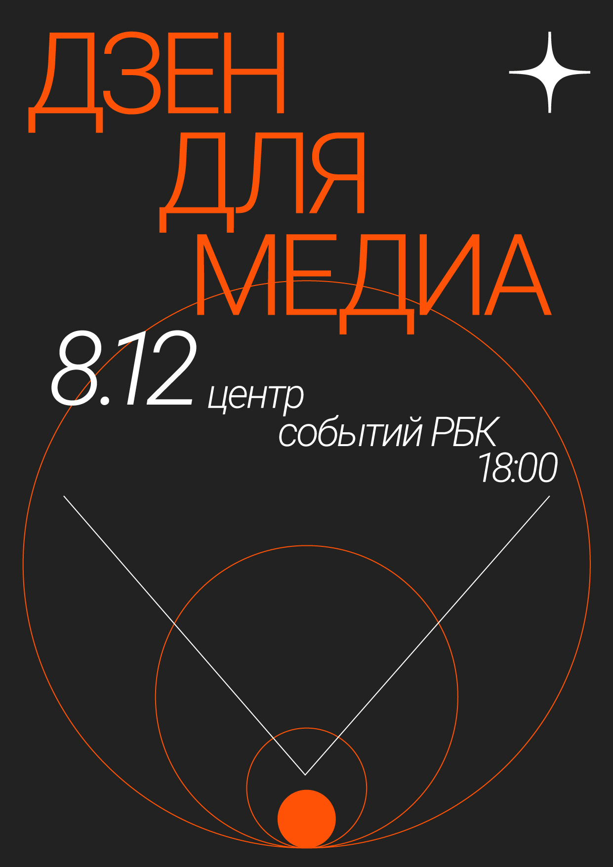
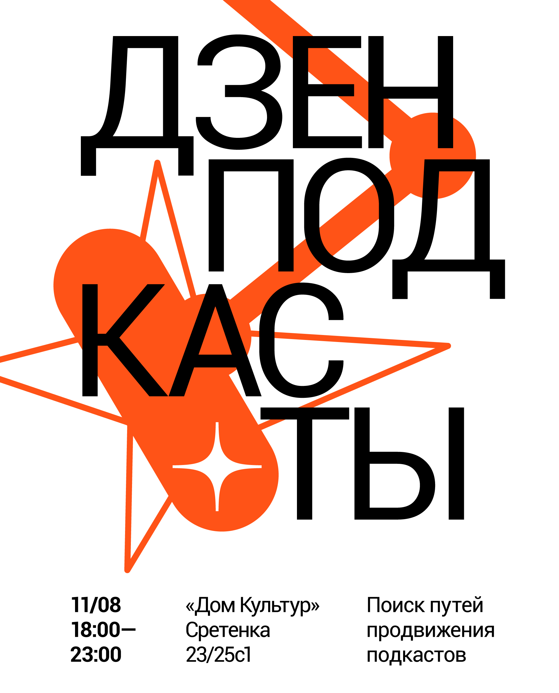
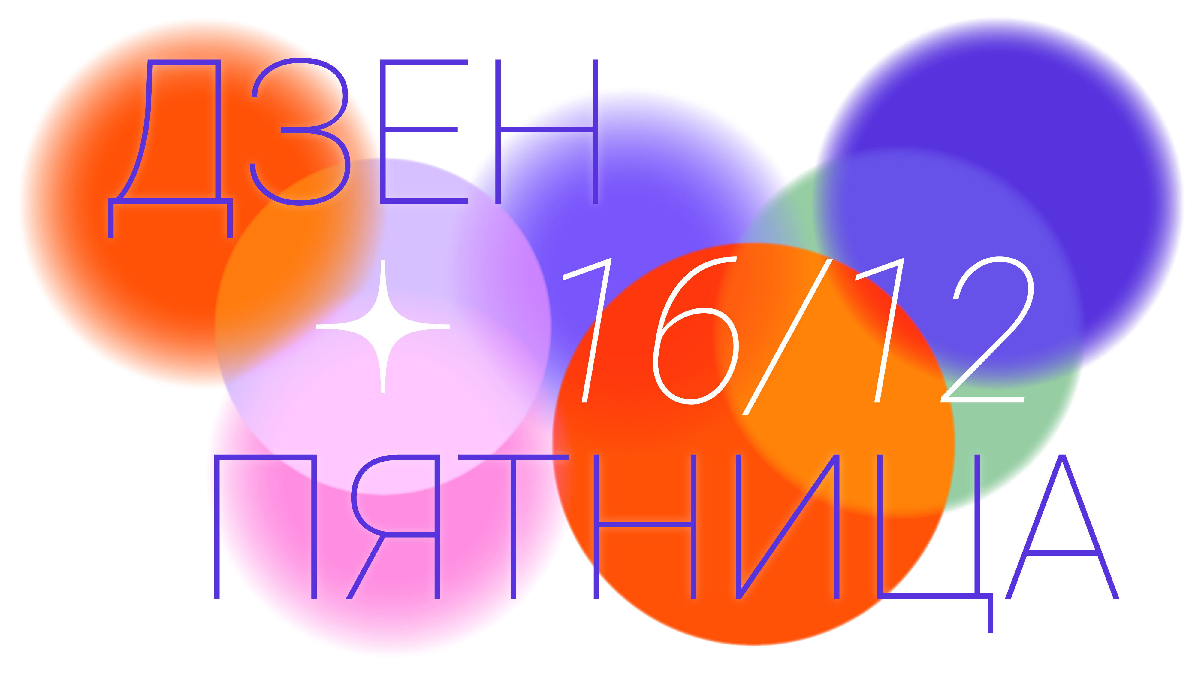
KVs, event identities, and digital invites created for Yandex Zen events. Simple shapes, recognizable imagery, and clean compositions were chosen to suit the diversity of event topics and guest profiles.
[art direction, graphic design]
KVs, event identities, and digital invites created for Yandex Zen events. Simple shapes, recognizable imagery, and clean compositions were chosen to suit the diversity of event topics and guest profiles.

︎
Yandex Zen: offline
[art direction]
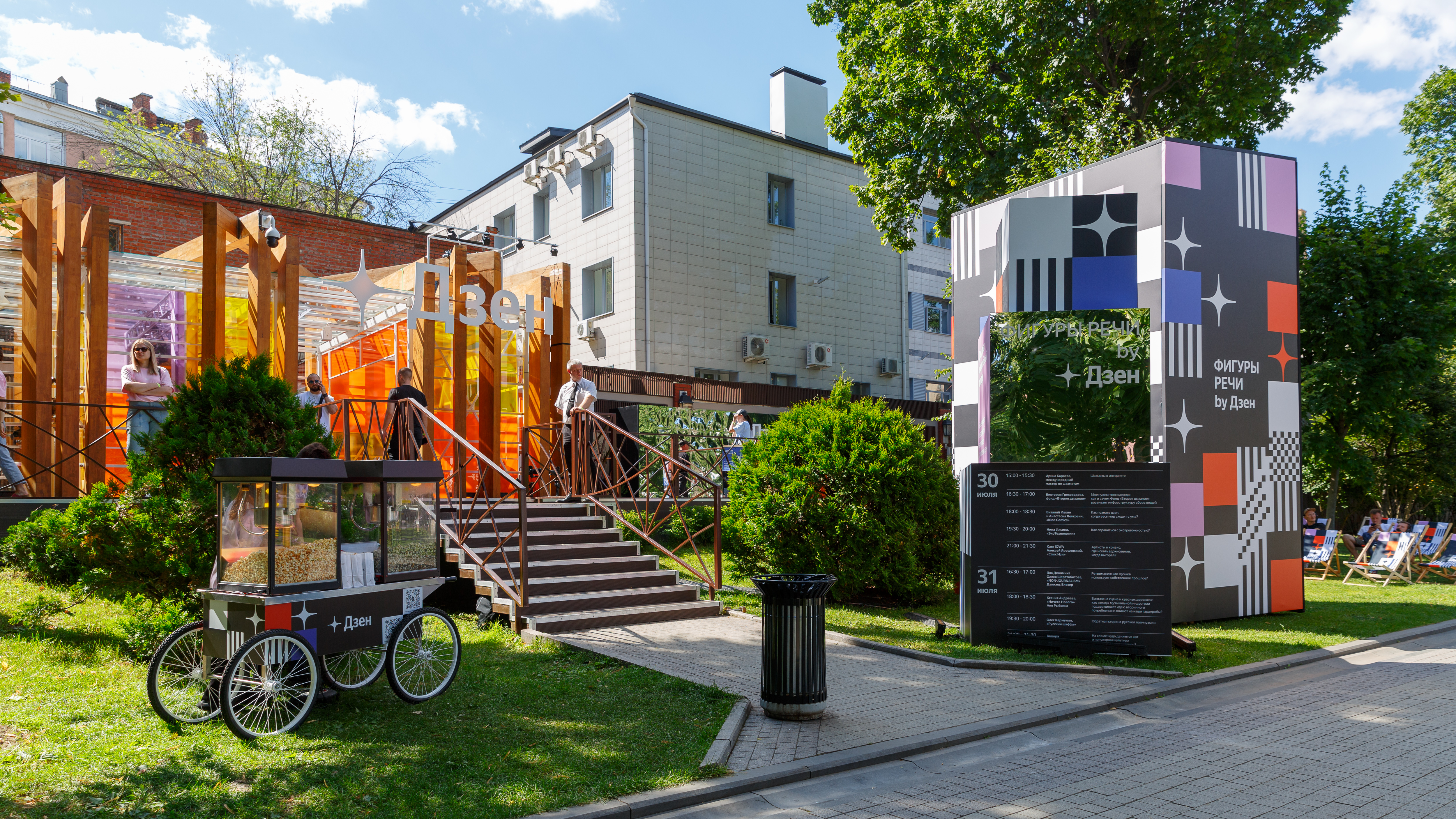
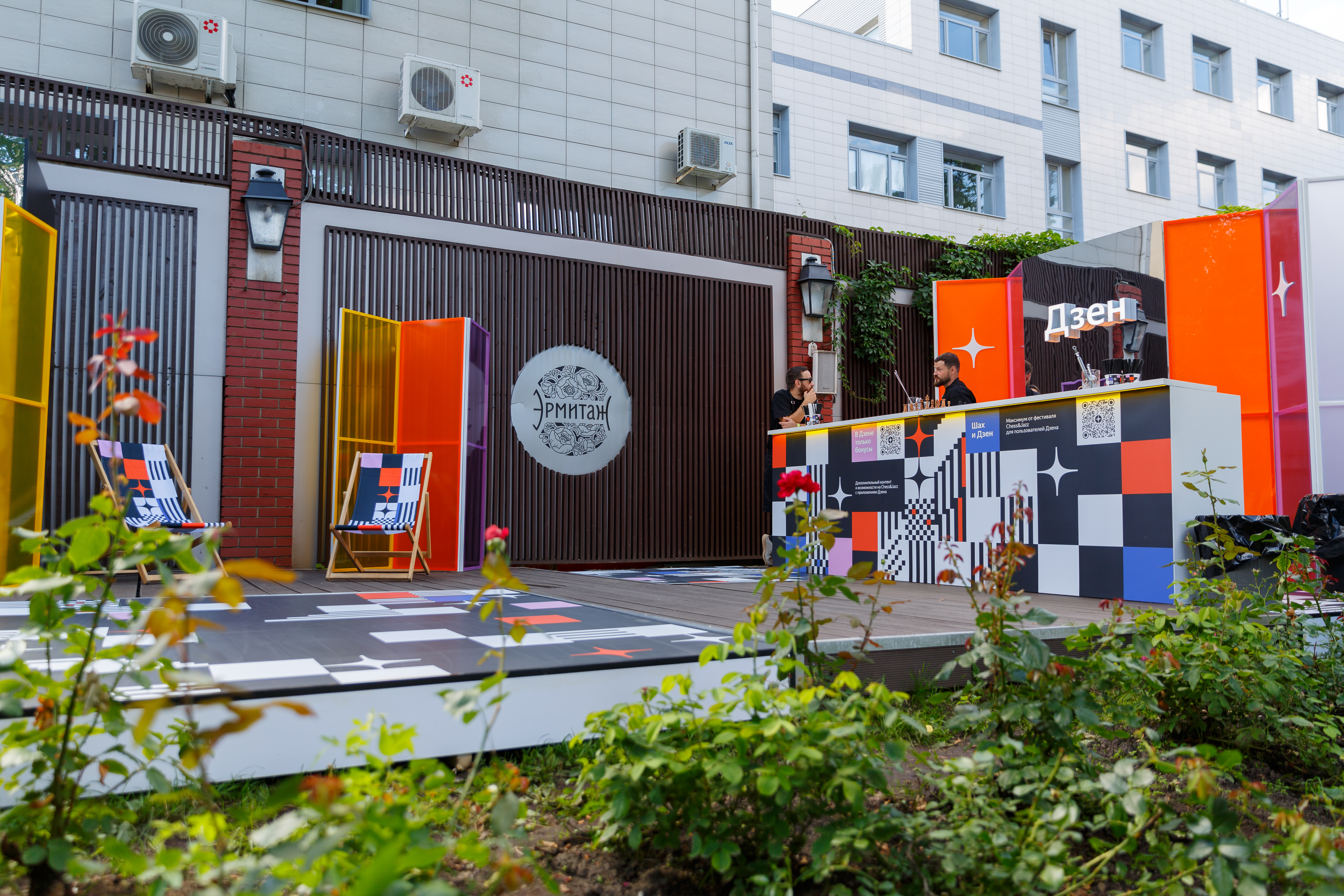
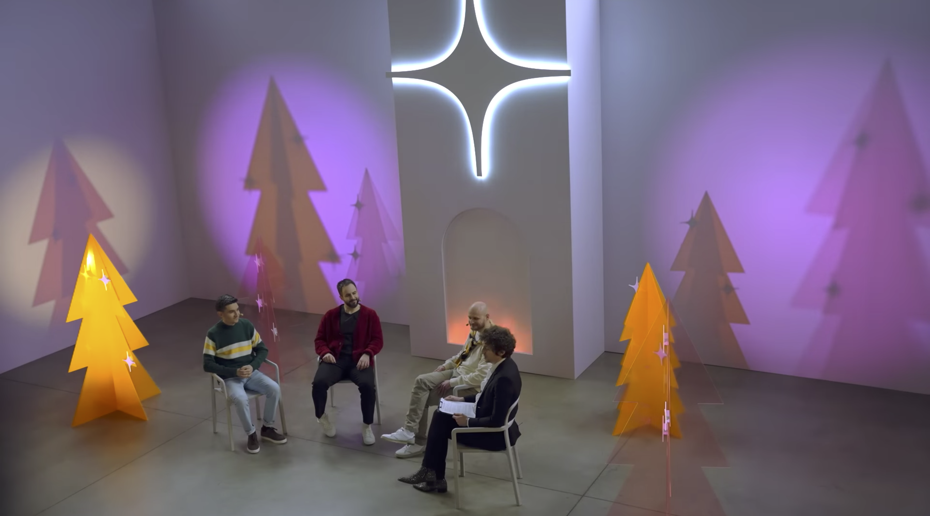
Examples of event zones and set designs developed in collaboration with external agencies. The key challenge was finding a visual balance between the brand identity and the event’s own atmosphere.
[art direction]
Examples of event zones and set designs developed in collaboration with external agencies. The key challenge was finding a visual balance between the brand identity and the event’s own atmosphere.



︎
Yandex Zen: employee events
[art direction, graphic design, animation]
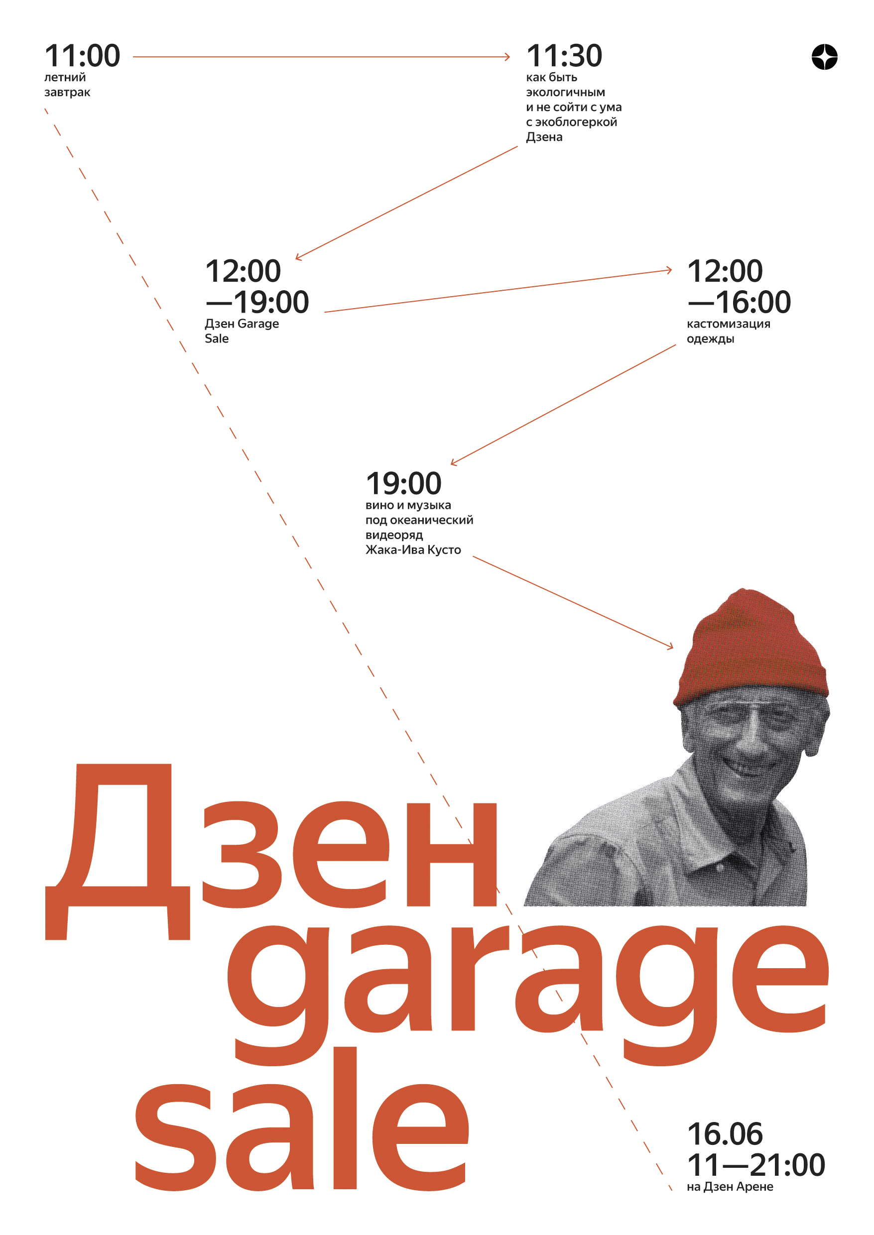
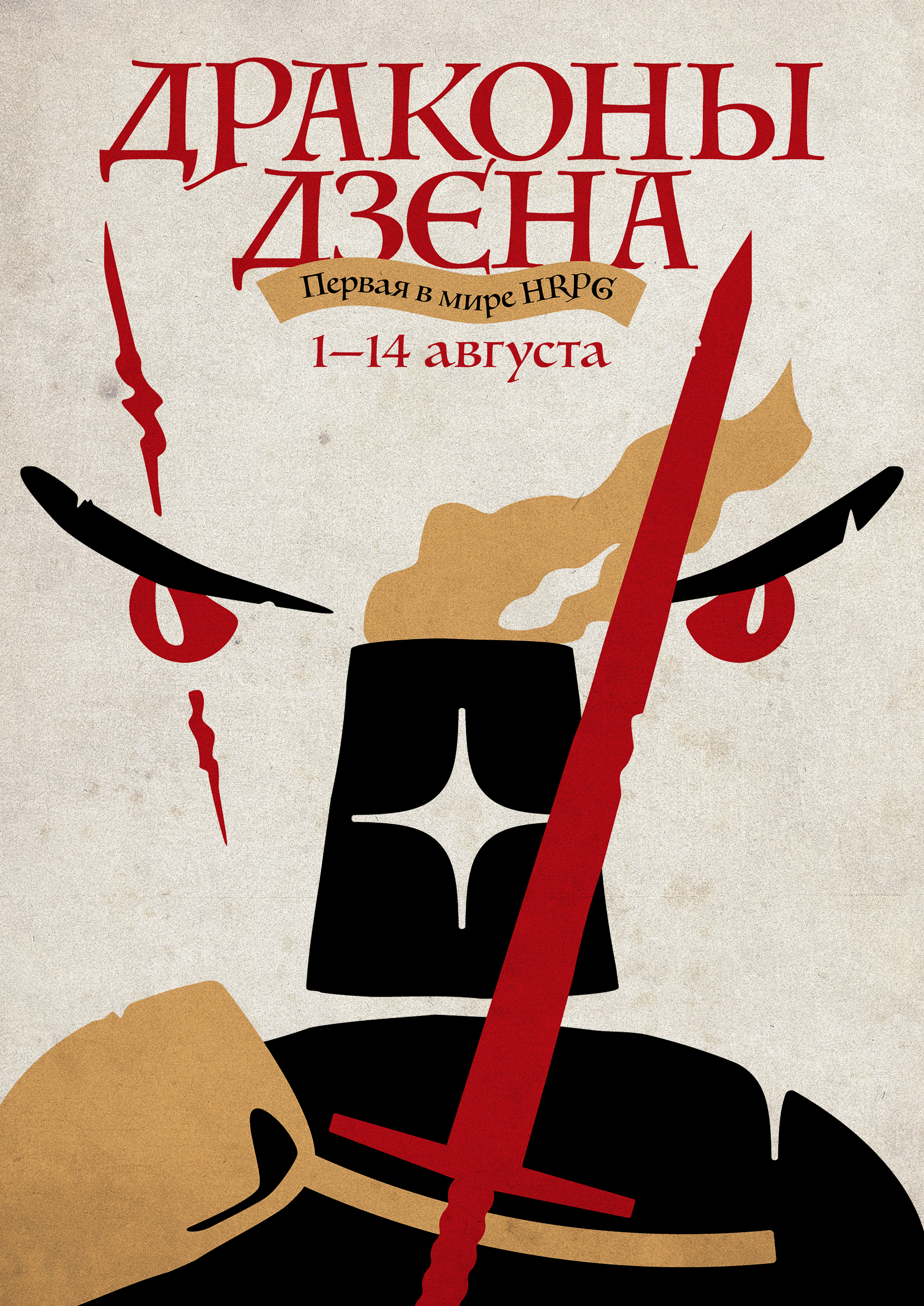
On my own initiative, I designed posters for internal events, because even a small poster can shift the team’s mood and create a warm, friendly atmosphere.
[art direction, graphic design, animation]
On my own initiative, I designed posters for internal events, because even a small poster can shift the team’s mood and create a warm, friendly atmosphere.


︎
Yandex Zen: merch
[art direction, graphic design]
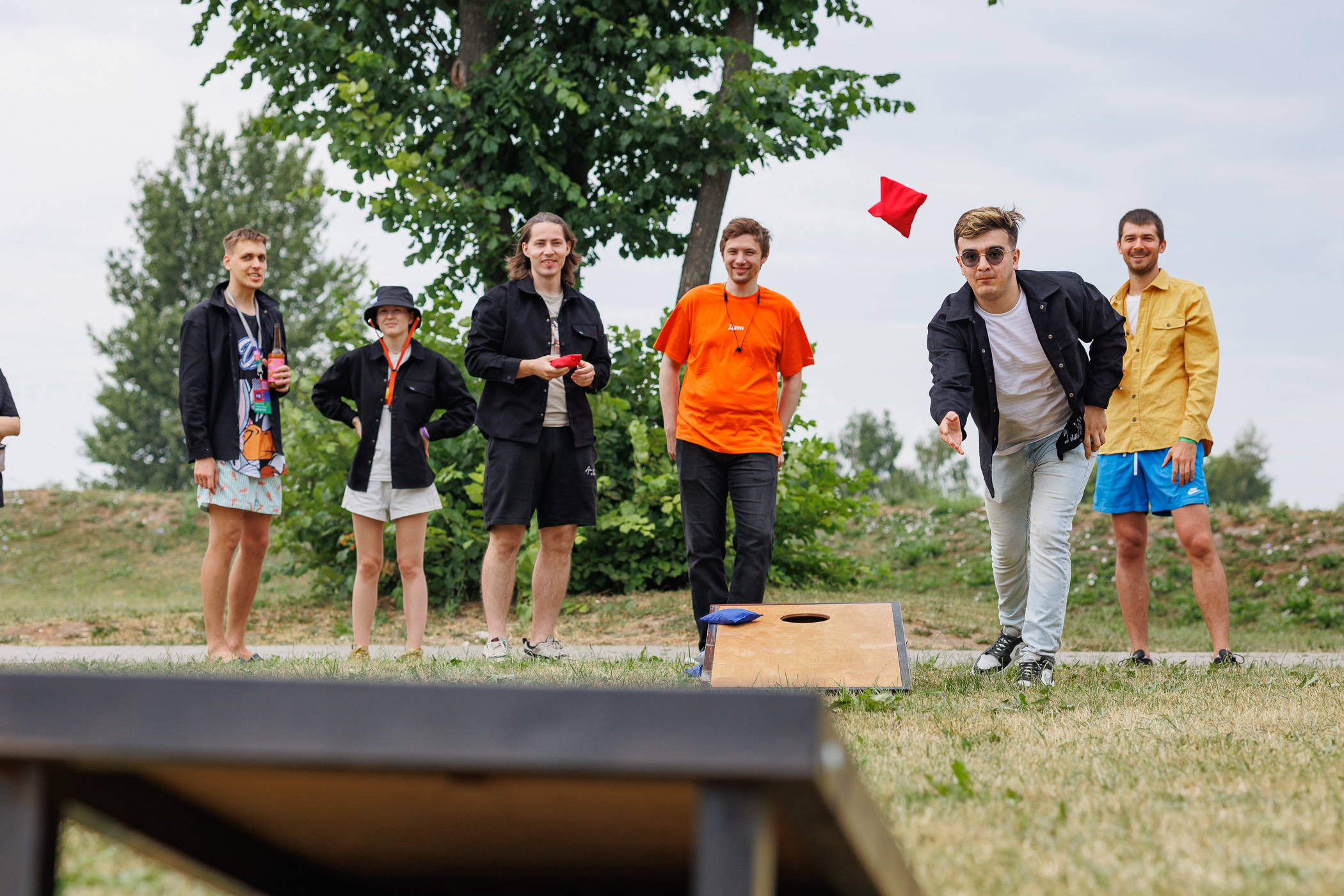
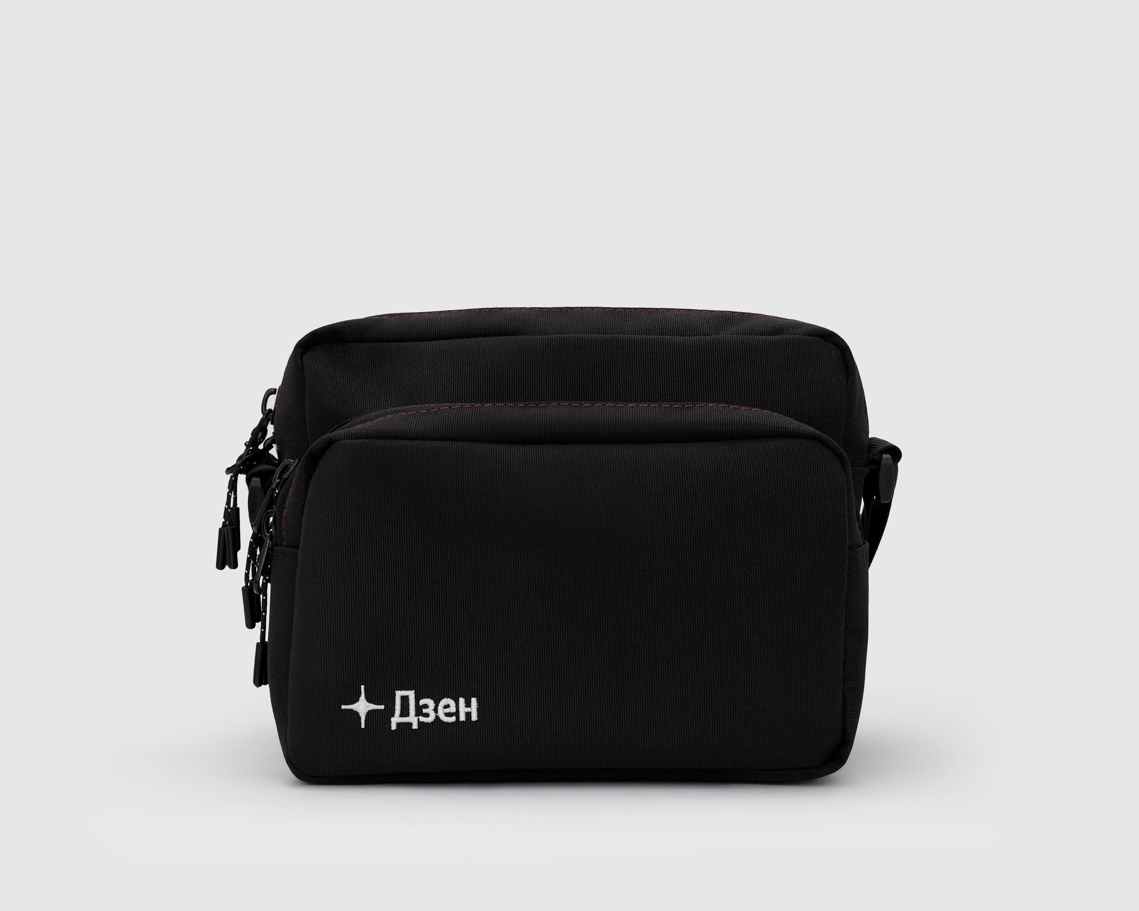
Employee merchandise created in collaboration with the in-house design team (overshirts, T-shirts, panamas, bags, and more).
We needed to design something that would appeal to over 500 employees, so our team developed a concept of minimal external branding with subtle, hidden details.
[art direction, graphic design]
Employee merchandise created in collaboration with the in-house design team (overshirts, T-shirts, panamas, bags, and more).
We needed to design something that would appeal to over 500 employees, so our team developed a concept of minimal external branding with subtle, hidden details.



︎
Hlebozavod №9: posters[graphic design, animation]
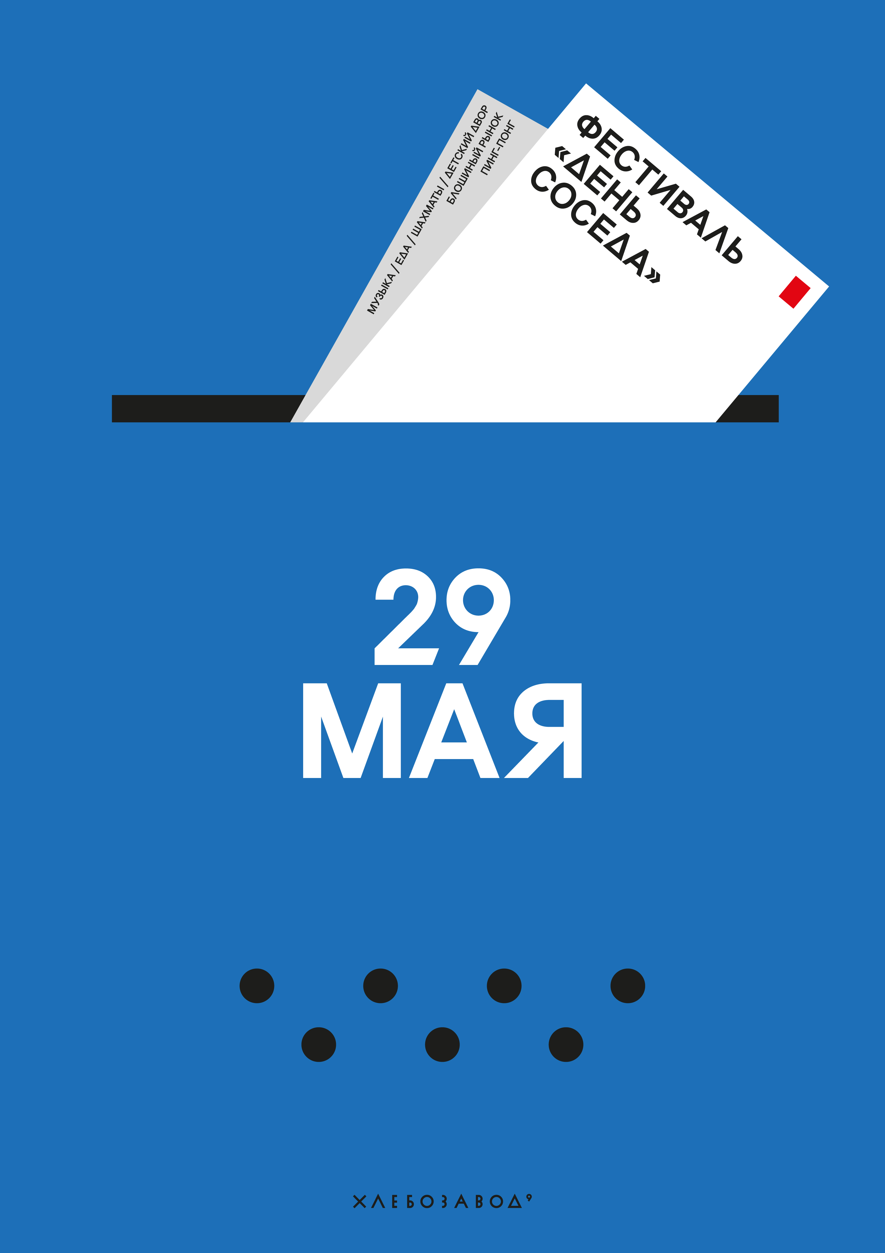
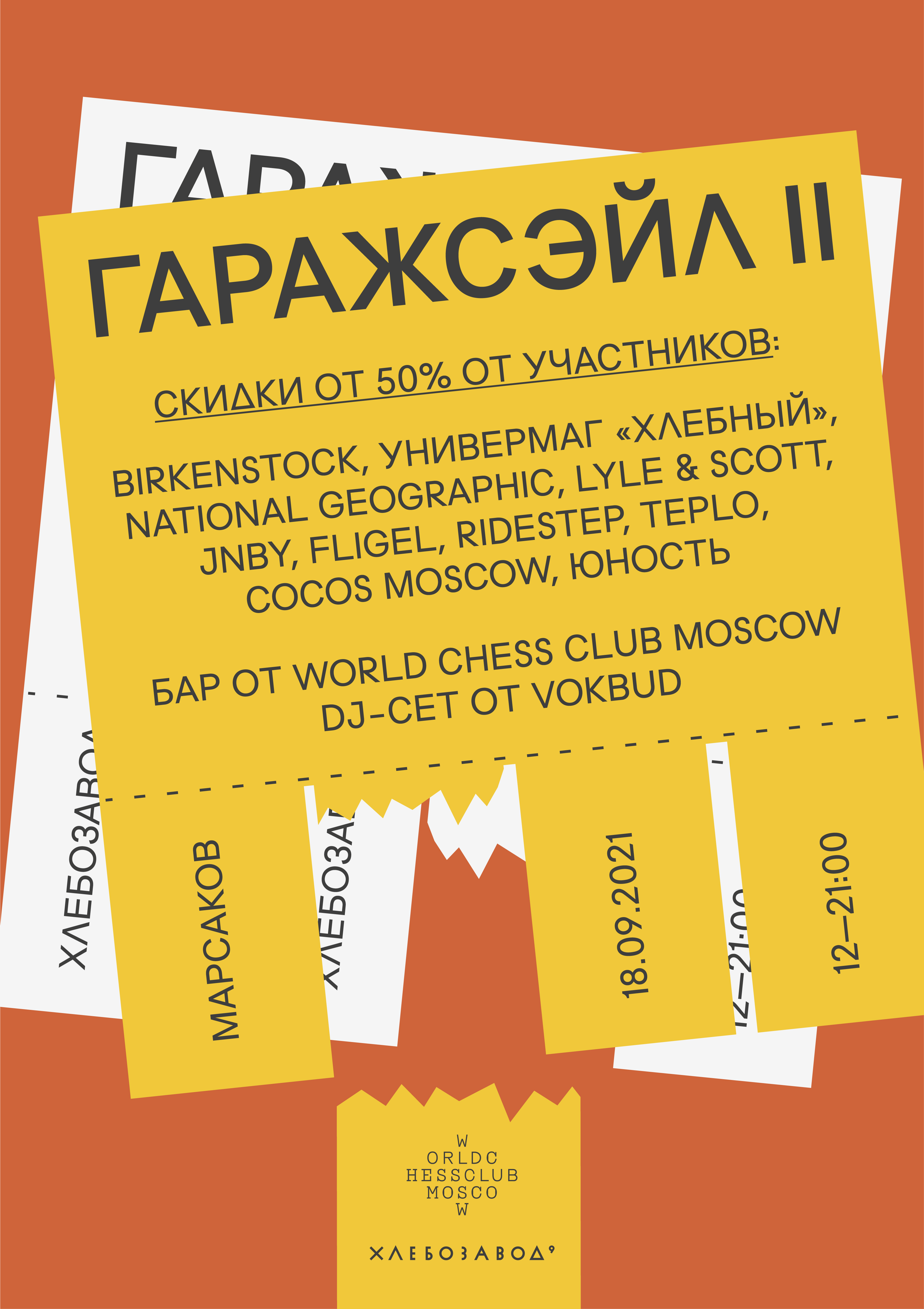
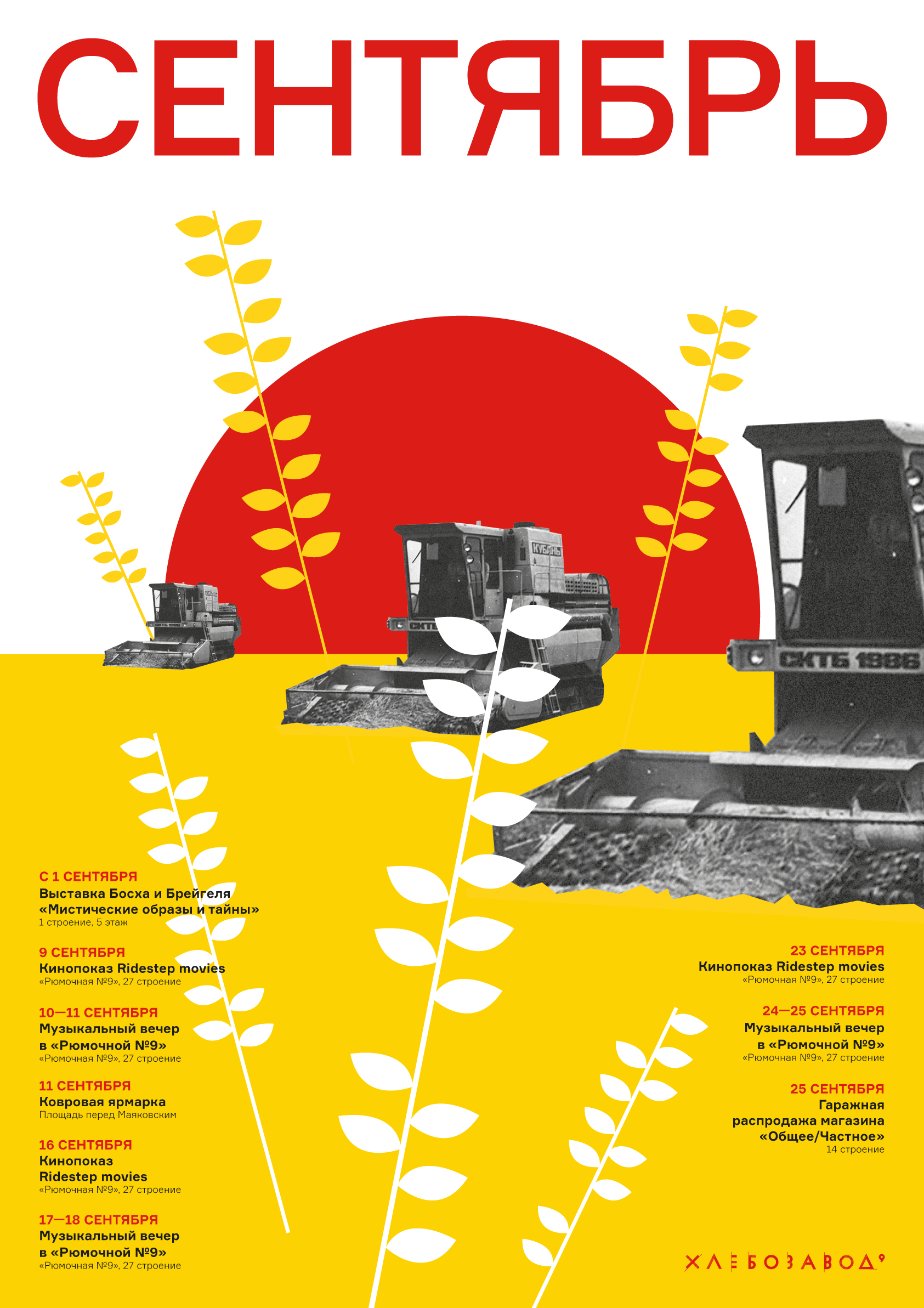
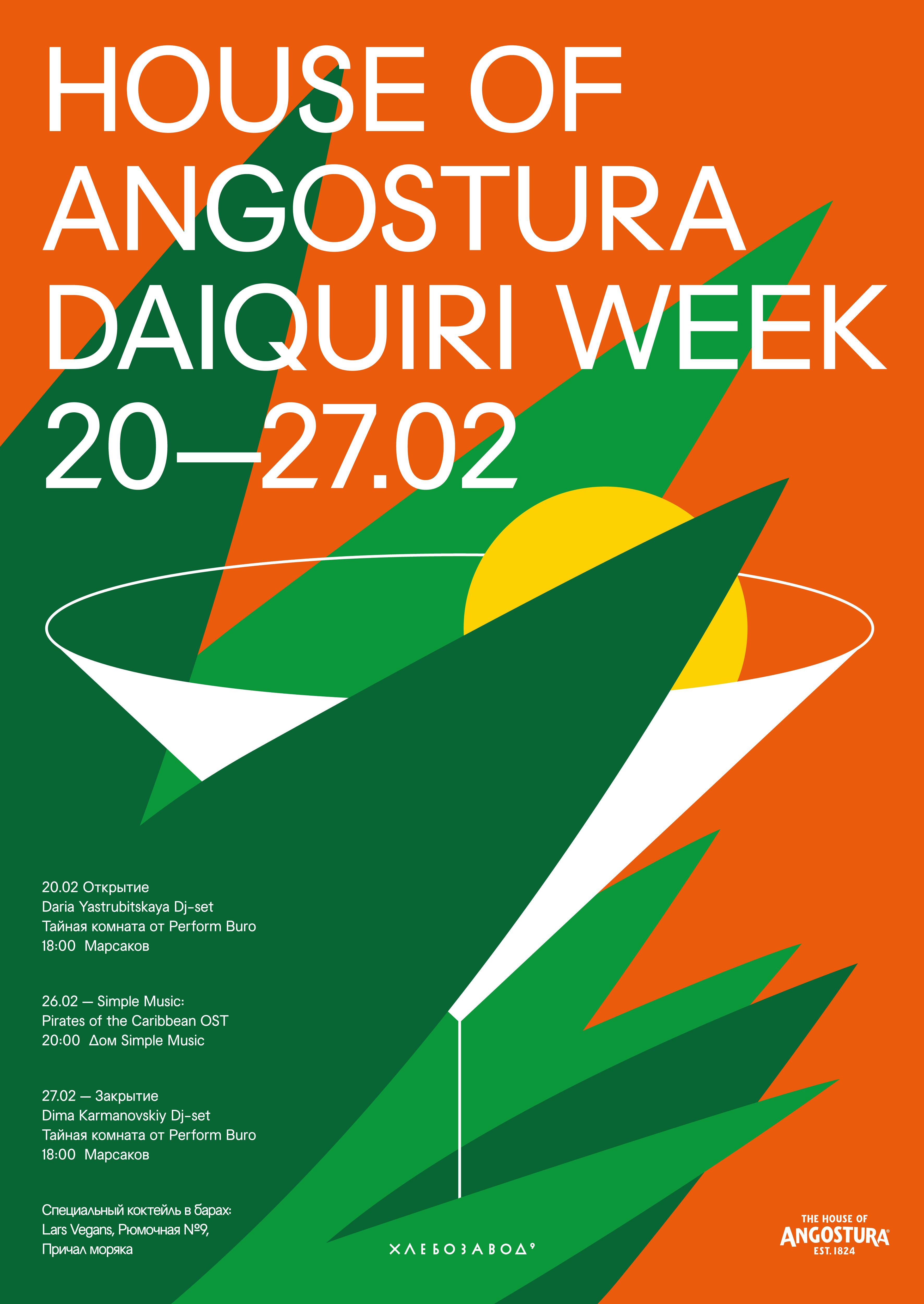
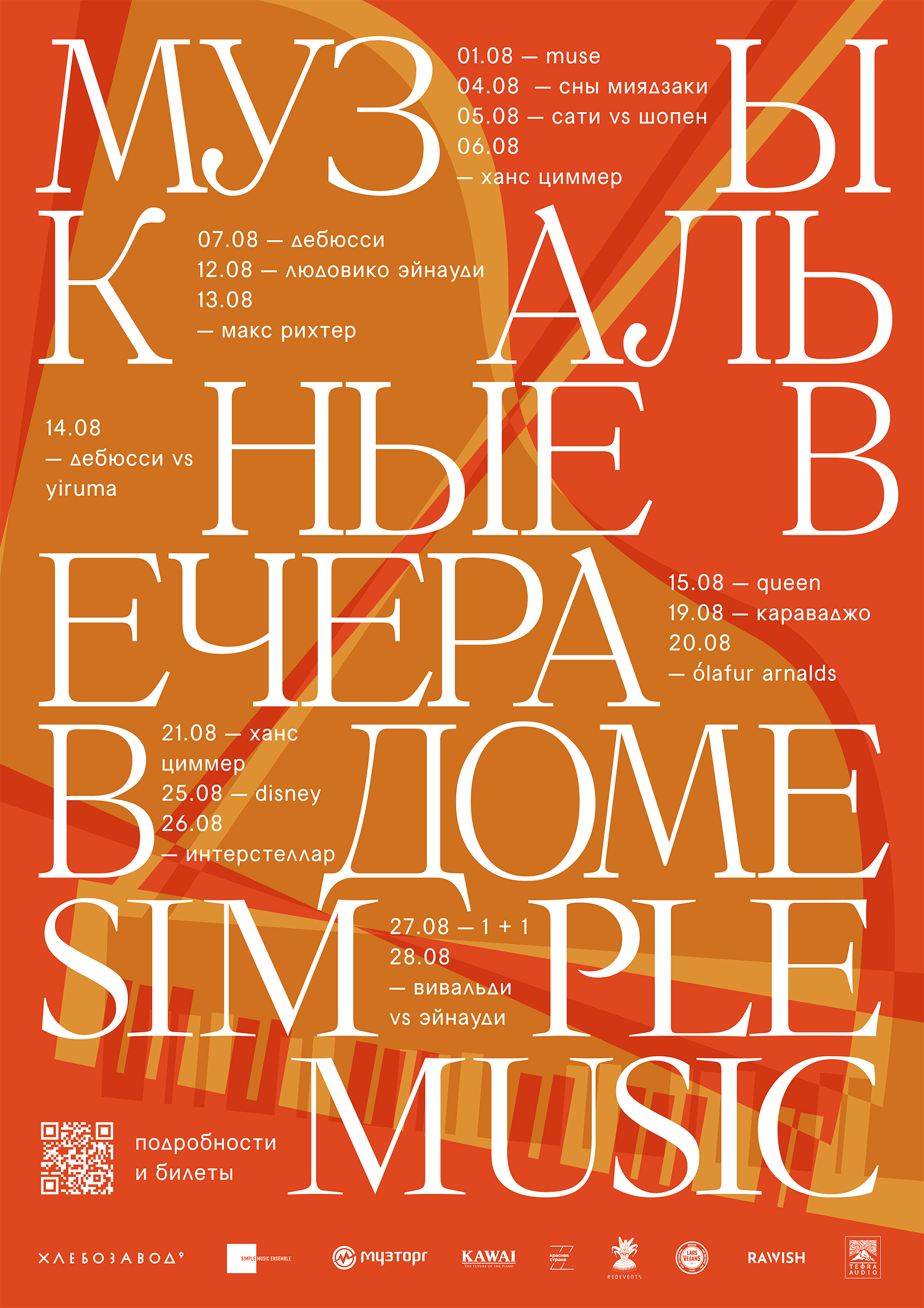
A key part of the work involved creating monthly posters with schedules of upcoming events. The poster board serves as both a meeting point and a photo zone. Visitors can easily spot it and often take pictures in front of it. That’s why the posters are always bold and eye-catching from a distance.
Some event posters were developed in collaboration with the venue’s administration. The goal was to maintain a balance between each event’s unique character and the visual aesthetics of the space.
A key part of the work involved creating monthly posters with schedules of upcoming events. The poster board serves as both a meeting point and a photo zone. Visitors can easily spot it and often take pictures in front of it. That’s why the posters are always bold and eye-catching from a distance.
Some event posters were developed in collaboration with the venue’s administration. The goal was to maintain a balance between each event’s unique character and the visual aesthetics of the space.





︎
Hlebozavod №9: offline
[graphic design]
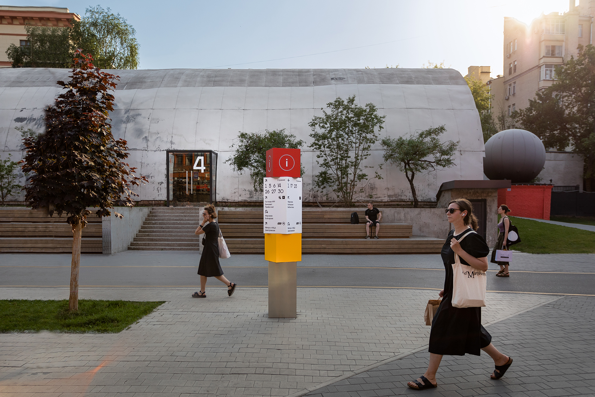
As part of the work on the venue’s visual environment, several major improvements were introduced: a complete redesign of the navigation system, custom building graphics and lettering, and an updated bulletin board featuring printed posters, promotional materials, and current information.
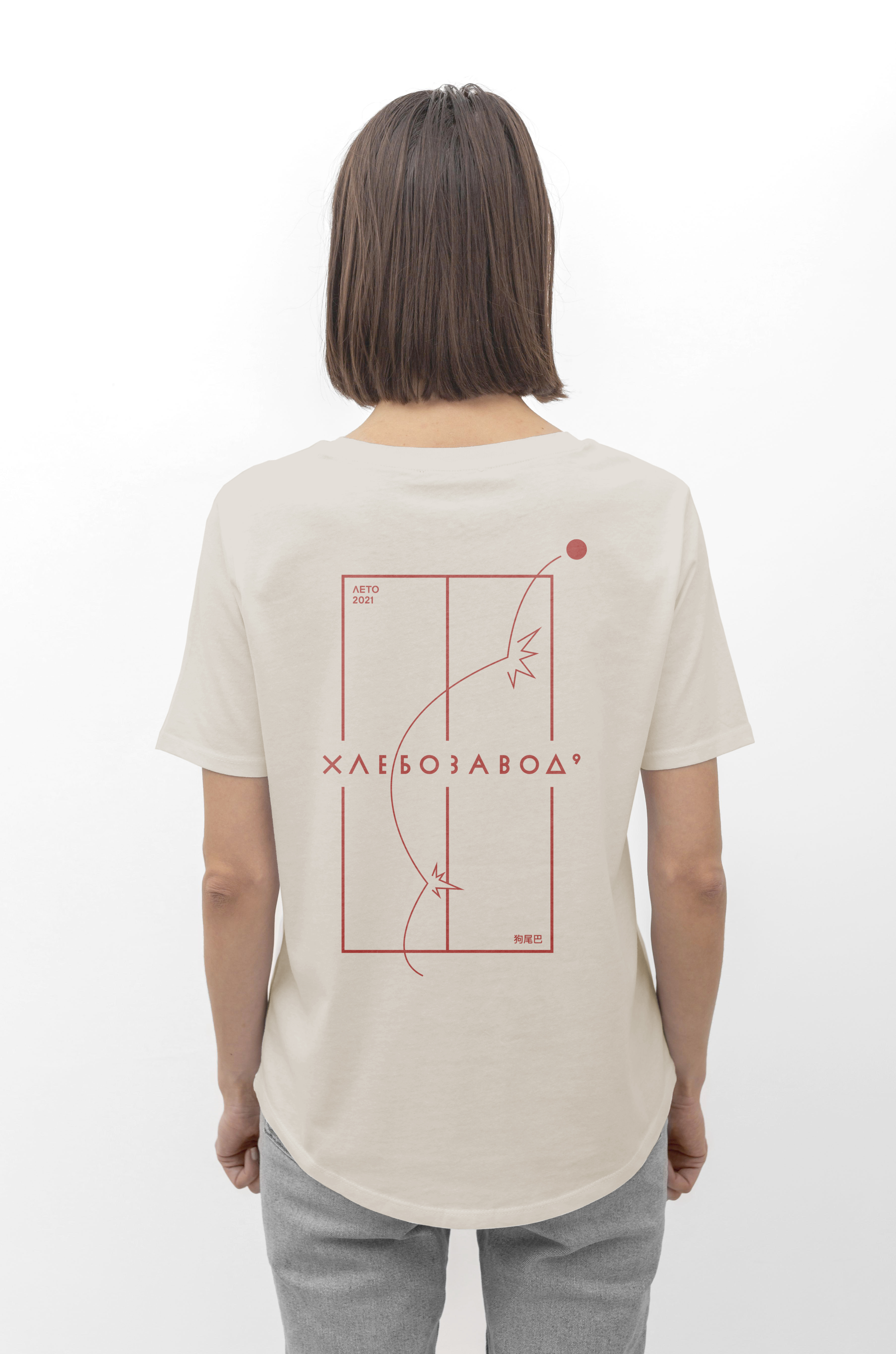
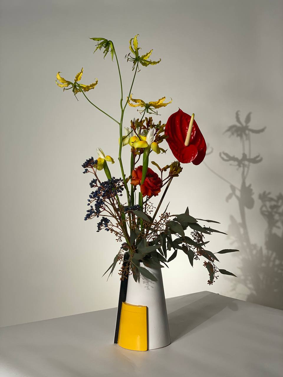
We also experimented with merchandise formats, including ping–pong–themed T-shirts and decorative flower vases.
[graphic design]
As part of the work on the venue’s visual environment, several major improvements were introduced: a complete redesign of the navigation system, custom building graphics and lettering, and an updated bulletin board featuring printed posters, promotional materials, and current information.
We also experimented with merchandise formats, including ping–pong–themed T-shirts and decorative flower vases.


︎
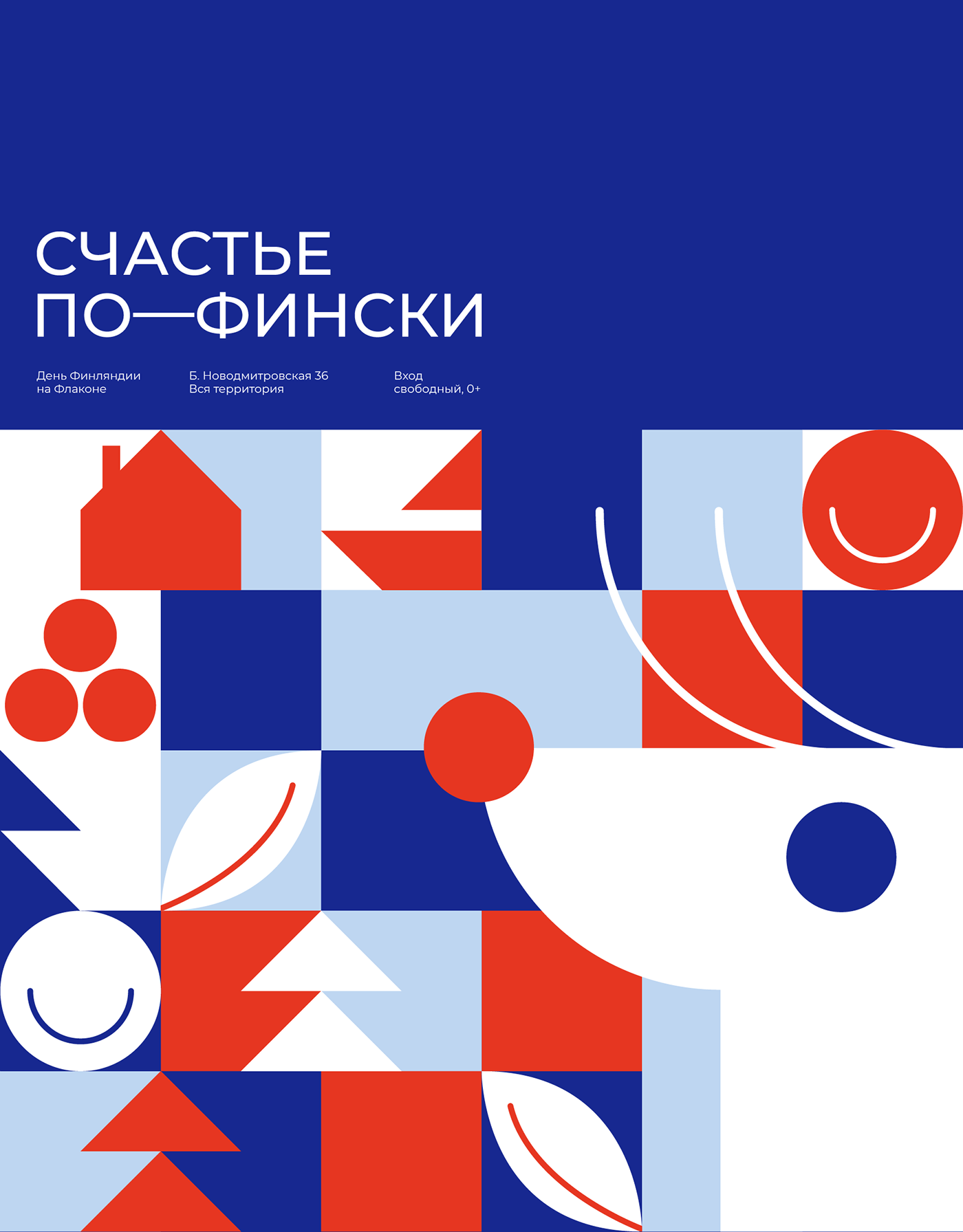
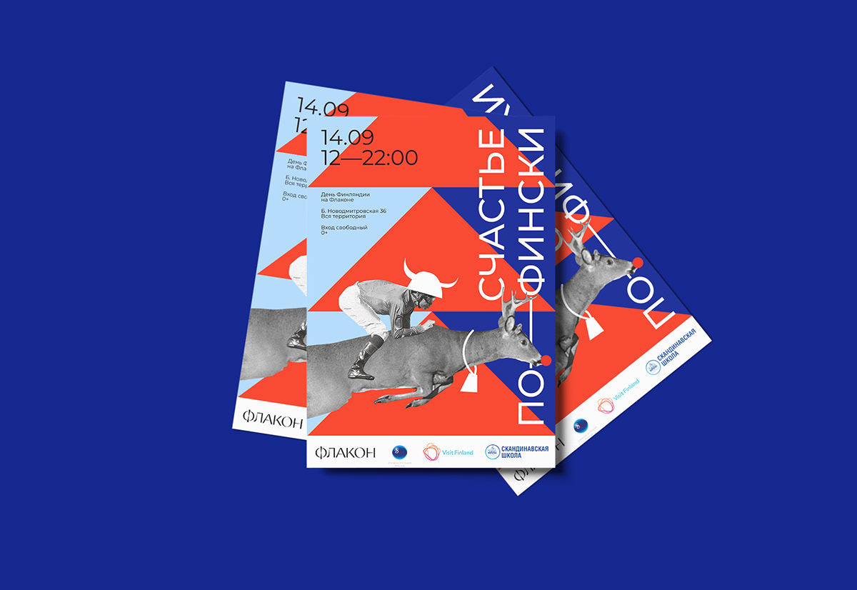
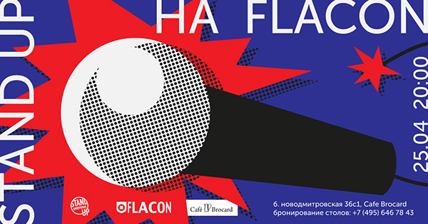
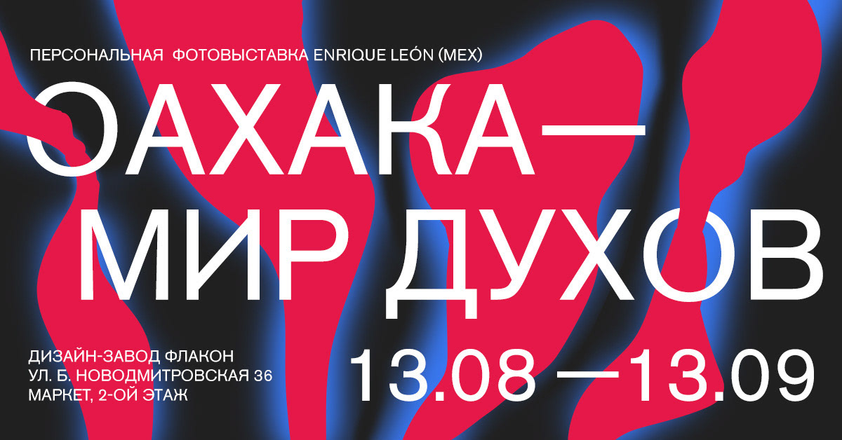
Flacon: events
[art-direction, graphic design]
KVs and visual identity for events were developed in collaboration with the venue’s administration. The goal was to provide organizers with a modern and high-quality visual framework.
[art-direction, graphic design]
KVs and visual identity for events were developed in collaboration with the venue’s administration. The goal was to provide organizers with a modern and high-quality visual framework.

︎
Flacon: SMM
[graphic design]
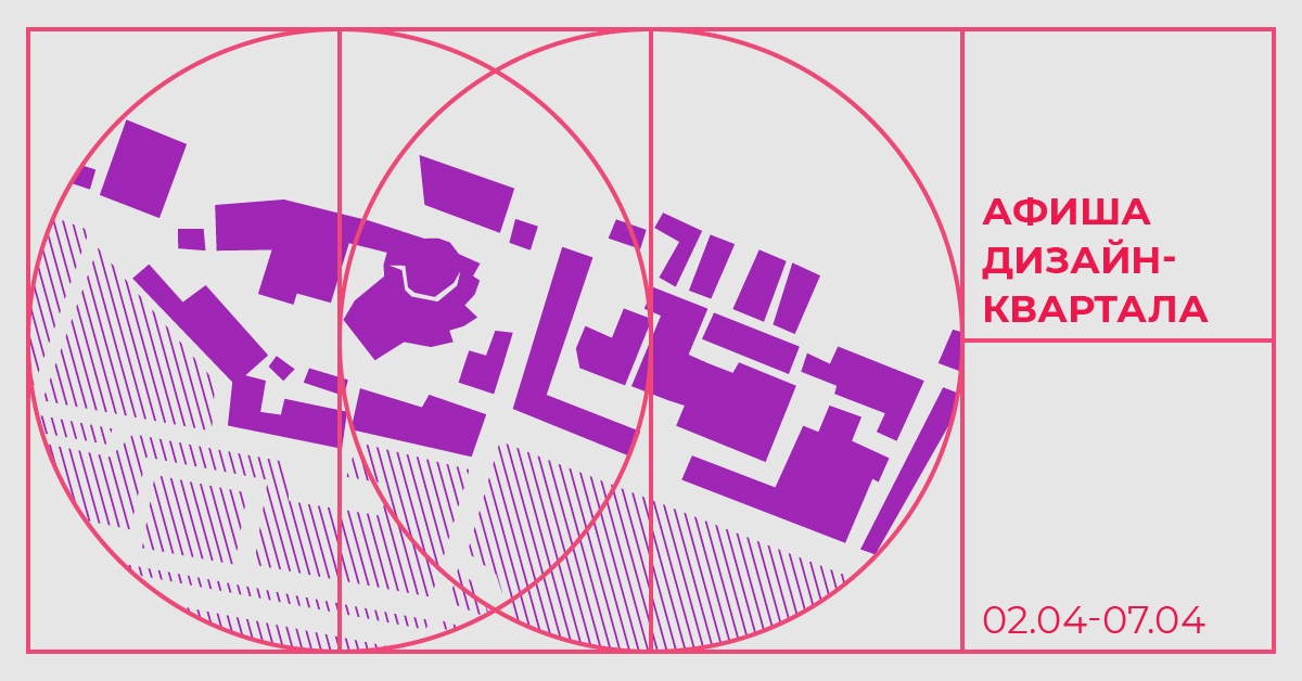
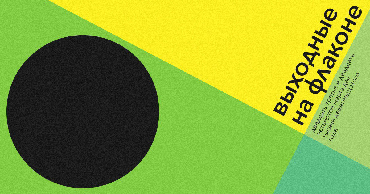
Digital posters for social media announcements of upcoming events. Featuring flat graphics and flexible themes, the goal was to create striking visuals that stand out in competitive digital feeds.
[graphic design]
Digital posters for social media announcements of upcoming events. Featuring flat graphics and flexible themes, the goal was to create striking visuals that stand out in competitive digital feeds.




︎
Random posters
[graphic design]
Posters are my favorite form of communication because they allow endless visual experimentation, test the consistency and flexibility of an identity, and convey any message to the audience clearly and expressively.
Here are some of my works. You can find more on my Instagram.
[graphic design]
Posters are my favorite form of communication because they allow endless visual experimentation, test the consistency and flexibility of an identity, and convey any message to the audience clearly and expressively.
Here are some of my works. You can find more on my Instagram.


